A blog about Data Visualization, Data Science, and work by Alex Katona. I'm passionate about advancing the field of Data Science. I use this blog to share my ideas, projects using various technologies (Tableau, D3.js, R, Python, etc.), and connect with others. I've been internationally recognized for my work from companies like Forbes, Kantar, and Tableau.
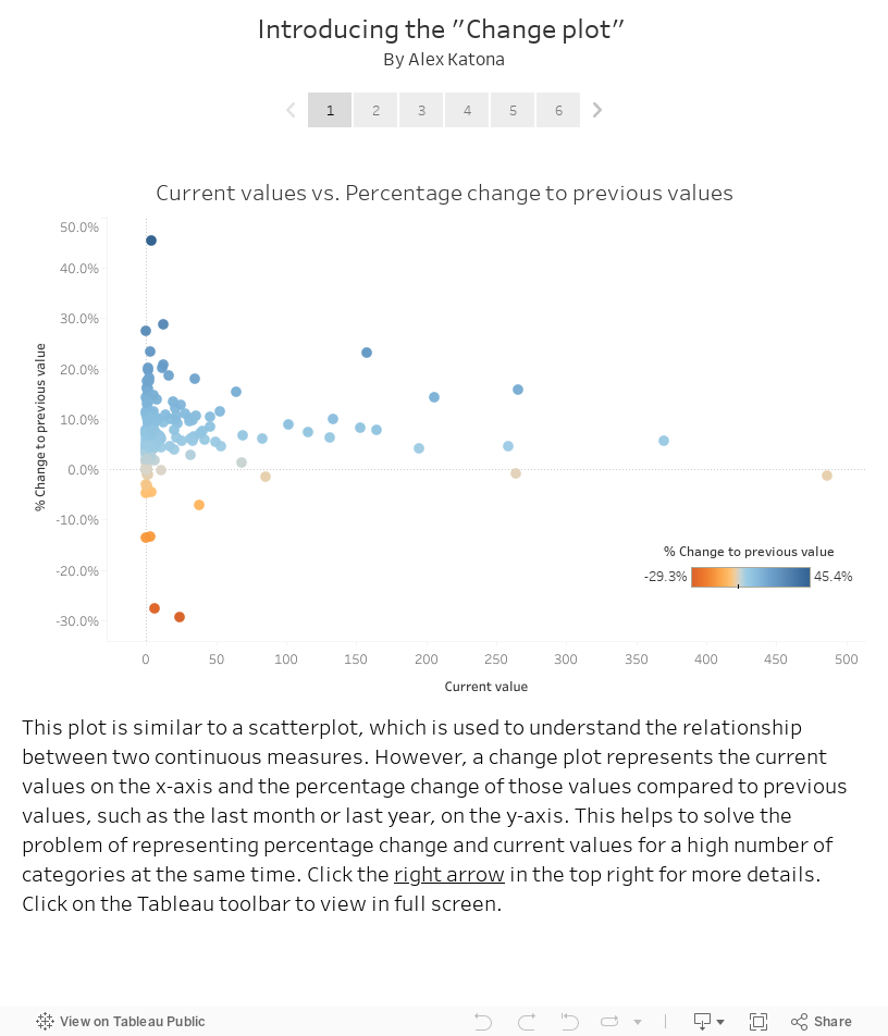
A common issue I've seen is how to visually represent percentage change and current values for a high number of categories at the same time. To solve for this, I created a new chart type called the "Change plot." Read and click through the Tableau story below to learn more about it. Click on the far right of the Tableau toolbar to view in full screen. Another new chart type I invented is the Polyarea chart, which you can read about here.
In this post, I included an example of how to build and modify Tufte boxplots in R. The data is from DataSF through the open data initiative and relates to SF Police Department crime incidents. Here is what the final product looks like (click the image to increase the size):
I was interested in displaying the percent of total for many
categories over time. However, I didn’t want to use a stacked bar chart or
stacked area chart. This is primarily because it can be difficult to determine
if the categories in the middle of these charts are increasing or decreasing
over time since there is no common baseline. I created a new way to visualize
this data in Tableau that combines many area charts (hence the name
Polyarea chart). This can be built in less than a few minutes. This chart has been internationally recognized and can also be created using D3.js.
There are advantages
to using a published data source, but there is one downside to using them. As mentioned in this link,
it is not possible to edit a published data source directly on Tableau Server
and requires that the developer make a local copy of the data source. The
method described in the link is not ideal for the following reasons:
I've received some great feedback from the Tableau community regarding my blog post about How to default your Tableau dashboard to yesterday (quadrupled my Total Site Pageviews!) so I thought I would answer a question that I received on Linkedin about a specific date functionality:
This is Part 2 of the Next Level Popping Parameters series. Part 1 of this series describes how to make horizontal Next Level Popping Parameters and Part 2 describes how to make them vertically. The methods that I’ve developed build upon the work that has been done by The Information Lab involving Popping Parameters.
Before we get started, I thought it would be good to answer
the following question: What are popping parameters and why should you use them? "Popping Parameters" is a term created by The Information Lab that refers to the idea of limiting what parameters are displayed
to the user based on what the user has selected.
A common request when building a Tableau dashboard is to have the dashboard default to a specific time frame (e.g. yesterday or the last 7 days), but also allow for the ability to select a custom date range. This post focuses on how to build this functionality.