I was interested in displaying the percent of total for many
categories over time. However, I didn’t want to use a stacked bar chart or
stacked area chart. This is primarily because it can be difficult to determine
if the categories in the middle of these charts are increasing or decreasing
over time since there is no common baseline. I created a new way to visualize
this data in Tableau that combines many area charts (hence the name
Polyarea chart). This can be built in less than a few minutes. This chart has been internationally recognized and can also be created using D3.js.
Here are the steps that you can use to create this.
1. My data is set up in the following format (with
randomly generated Sales data):
2. In Tableau, right click and drag the Date
dimension to the columns shelf and select “Date (Continuous)”
3. Drag the Category to the columns shelf and Sales
to the rows shelf
5. In the dialog, use the following settings:
7. Duplicate the Sales pill by holding CTRL and
clicking and dragging the pill to the right of the original Sales pill
8. On the Marks card, click on the name of
duplicated version and change the mark to “Polygon”
9. You should have a view similar to this. I selected
“Entire view” above the columns shelf to make it easier to see
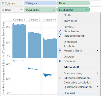
10. On the duplicated pill, click the down arrow and
select “Dual axis”
11. Right click on the secondary axis and select
“Synchronize axis.” Right click the axis again and uncheck “Show header”
12. Click on the down arrow of the Category pill to
sort the Categories by descending sum of Sales.
13. Finally, color the marks (if you want), remove
gridlines under the “Format” menu, and remove the Date header. I’ve used the
same gray color for both the polygon and area marks and the automatic setting
for transparency. The transparency will change when you select dual axis,
so this provides some contrast between the marks.
Here is the final result:
The benefits of this chart include the height that shows
magnitude (like a bar chart), the ability to see variation over time (like a
line chart), and the ability to show a line between the start and end points (like
a slopegraph).
It is important to understand that this is showing the % of
Total for the Category using a Running Total of Sales. Therefore, the % of Total
that you see is the % of Total for that Category using the sum of Sales from
that day and the Sales from all previous days combined. If you want to see
the % of Total for a category on a daily basis, use only one table calculation
for % of Total on both Sales pills (as shown below). You’ll notice that using a
Running Total is able to smooth out the changes over time, which helps to
reduce noise in your data.


