The example dashboard referenced in this tutorial and embedded below was used in my tutorial about How to default your Tableau dashboard to yesterday.
We will be focusing on how to simply the user experience of a dashboard that defaults to a specific time frame (e.g. yesterday or last 7 days) and also allows for the ability to select a custom date range. The goal is to only show the custom date range parameters when the user is interested in selecting a custom date range.
Note: Steps 1 through 3 of Part 2 are the same as Part 1. Skip to Step 4 to see how they are different.
Step 1: Create a calculated field of the average of 1 named Fake sheet calc.

Step 2: Create a new worksheet named Fake sheet and add the Fake sheet calc to both the columns and rows shelves. You can do this easily by dragging the Fake sheet calc to the columns shelf from the data pane. Then, Ctrl + Click + Drag the Fake sheet calc on the columns shelf to the rows shelf to duplicate it. This is what the result will look like:

Step 3: Format the worksheet so that it is a completely blank sheet. Right click the axes to hide the headers, remove the Grid lines and Zero lines of the scatterplot under Format > Lines, remove the borders under Format > Borders, and turn off the Tooltips.

I've noticed in Tableau 9 that hovering your cursor over the data point of the worksheet when it is on a dashboard will highlight the point even if you make it white or 100% transparency. I avoided this cursor highlighting by clicking, holding, and then dragging to the right in the scatterplot so that the point is out of the view on the worksheet. Here is what the final result should look like:

Step 4: Create the following boolean calculated field:

Step 5: Add the Fake Sheet Parameter Calc to the filters shelf and filter for False. You can show the Date Selection Parameter on the worksheet if you want to test the functionality before adding the worksheet to the dashboard.

Step 6: On the dashboard, add a tiled vertical layout container to the dashboard and add the fake sheet at the top, the Custom Date parameters, and a blank object (at the bottom) into the container. Make sure that the title is turned off on the fake sheet.


This is the key to creating the popping functionality. Everything below the Fake sheet has a fixed height so they will all move as one unit. The Fake sheet's height is not fixed so it will push this group of filters up or down based on the Date Selection Parameter value. If you have more filters that you would like to add to the dashboard and still have the popping functionality, you just have to add them into the vertical layout container below the fake sheet with a fixed height.
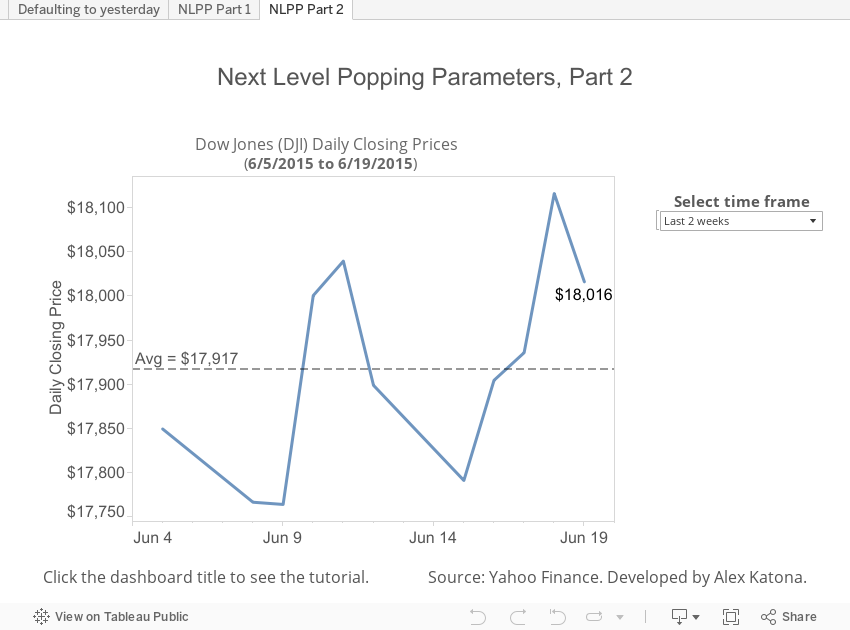
Step 8: Add the Date Selection Parameter to the dashboard as a floating object and change the title to "Select time frame." You can add the parameter to the dashboard by using the down arrow in the top right of a worksheet on the dashboard.
Step 9: Move the Date Selection Parameter (i.e. "Select time frame" parameter) so that it is floating over the Custom End Date Parameter and hides the Custom End Date Parameter when the Date Selection is set to the Last 2 Weeks.

Step 10: Switch between the Last 2 weeks and Custom Dates on the "Select time frame" parameter and you will notice the parameters moving up and down.
When you select Custom Dates, the "Select time frame" parameter may be hiding parts of the Custom Date parameters (e.g. left image below). This is where the blank object is able to help; adjust the height of the blank object (right image below) using "Edit Height" under the down arrow in the top right. Keep adjusting the height of the blank object and switching between the Last 2 weeks and Custom Dates values until you are able to prevent the overlapping and have the Custom Date parameters display correctly below the "Select time frame" parameter when you select Custom Dates.
Step 11: The Custom Start Date parameter will still be visible when the Date Selection is set to the Last 2 weeks. In order to hide it, drag a Text object onto the dashboard as a floating object without typing anything in the Text object. Select the Text object (can be done easily under the Layout section) and format the shading to be white. Then, drag the white Text object over the Custom Start Date parameter so that is hidden when the "Select time frame" is set to Last 2 weeks.


Step 12: Verify that the functionality works as expected when published on Tableau Server and displays correctly across all browsers.
You can also add a note somewhere on the dashboard about using the Pause Automatic Updates icon when the dashboard is published to Tableau Server so that both of the Custom Date parameters will apply at the same time instead of one at a time.
Now that you have improved the user experience, learn how to work with Tableau data sources.