Introducing the "Change plot"
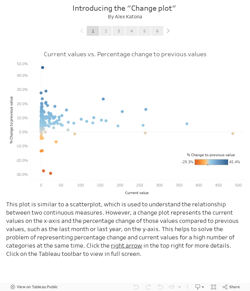
A common issue I've seen is how to visually represent percentage change and current values for a high number of categories at the same time. To solve for this, I created a new chart type called the "Change plot."
Read and click through the Tableau story below to learn more about it. Click on the far right of the Tableau toolbar to view in full screen. Another new chart type I invented is the Polyarea chart, which you can read about here.